Howdy! Welcome to our community of more than 130.000 members devoted to web hosting. This is a great place to get special offers from web hosts and post your own requests or ads. To start posting sign up here. Cheers!
/Peo, FreeWebSpace.net
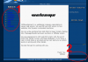
Comments:
-I don't think the white blends well with the blue.
-I really like the fonts you use for your graphics.
-I don't know why I'm seeing a scrollbar in 1024x768 when the whole site doesn't need it? Fix it.
-The graphics on top of the index page should show Home instead of Welcome.
-The rollover inside the center table is very hard to see.
There's no style there. The links are in the class "fade". Look at his stylesheet. No fade class visible, not to mention there should be no HTML tags in a CSS file. Fade, I'd imagine, is controlled by that fade.js script, which of course is proprietary. All that results in blue links on a blue background which is, like I said, not too attractive.
Mozilla 1.0RC2, to answer your question. I meant to download RC3 last night but I forgot about it.